Quandaries and blogger photos test

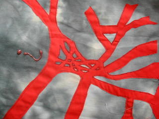
Lisa asked what quandries looked like (or is it quandaries? neither looks right to me at the moment...). I started to make a journal quilt on this topic earlier in the year. I used Spaghetti Junction, a notoriously complicated motorway (highway) junction in Birmingham as my starting point. I never finished it as a proper journal quilt as I got too many other ideas but here it is:
Karoda suggested I put up a test page of a Blogger photo (I hope one is enough to compare them) to see if it looks better than Hello so this one can be it!
Well, I must say it is neater than Hello but it did take about 4 times as long and I'll have to find another way to turn the photos the correct way round (I used to do that in Picasa and it stayed like that when I sent it via Hello - I'd have to involve Irfanview into the equation. But if enough of you prefer it this way, I'll do it! Meanwhile, I'm afraid you'll have to turn your computer on its side to view 'Quandary' (the question mark should be at the bottom - I did this with a glue gun, by the way).


4 Comments:
Note to self: don't drive in Birmingham England if this is an example of the highways.
If the only difference is having some text next to the photo, and you find picasa/hello easy to use, I say stay with that.
As long as you keep posting those fab pix I don't care which you use. And you're right, it's quandaries! Great example!
Looks like a perfect quandry to me!!!
Pat in NJ
The "Quandary" showed up in my self portrait for the Quilting Arts magazine challenge too--that thing *does* get around!
Flickr works great for adding photos to blogs too.
Post a Comment
<< Home